 Pages Before Pixels
Write page copy that people can scan
Last reviewed
The short version
- Put the answer first and the background last.
- Use headings that say what the section holds.
- Keep paragraphs short. Turn long runs of items into lists.
People scan
On a screen, many people skim before they read. Dense, cluttered writing puts people off.[1] So plan your copy for a quick look first and a slow read second.
Here's the same made-up bakery text, written twice.
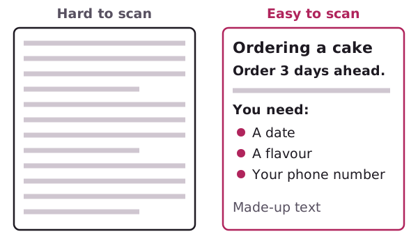
The right-hand version holds the same facts. It's just shaped for skimming.
Answer first
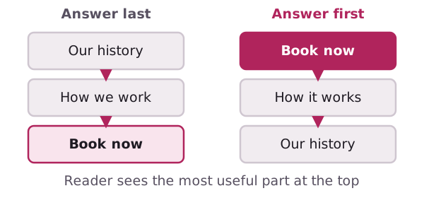
Start with the purpose and the bottom line.[2] Put the most important information at the beginning.[2] Save background for the end, and only if it's needed.[2]
Digital.gov also suggests pages with key information at the top.[1]
Try it on your own page. Write the one thing the visitor must know. Make that your first line. Then add the detail below it.
Headings that carry the page
Headings are signposts. Use them to give a page a clear shape.
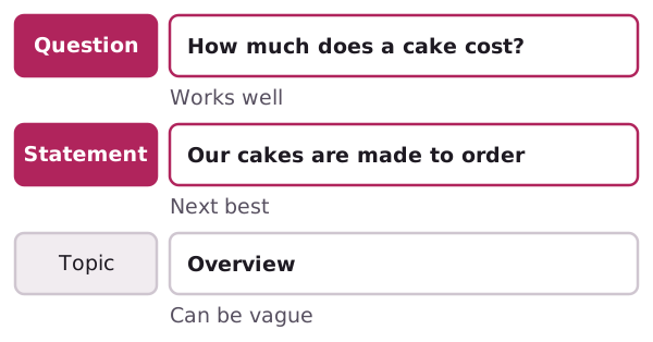
Digital.gov lists three kinds, and ranks two of them:
- Question headings work well if you know what people will ask.[3] A question-and-answer layout helps people scan and find specific details.[3]
- Statement headings come next. They're specific, bold and direct.[3]
- Topic headings are the vaguest. "Overview" and "General" tell the reader little.
Keep headings short. They shouldn't be so long that they overwhelm the text.[3] Use heading levels the same way on every page, so there is a clear order.[1]
Short paragraphs and lists
One idea per paragraph. If a paragraph runs past five lines on screen, split it.
Lists are good for things people compare or tick off. Lists support easy scanning.[1] Opening hours, ingredients and steps are all natural lists.
Don't turn everything into a list. Two or three plain sentences are often clearer than a list of five fragments.
Plain words, active voice
Active voice makes it clear who should do what.[4] "We bake it fresh" is clearer than "It is baked fresh daily."
Digital.gov says research finds content easier to understand when it uses shorter words, short sections, active voice and the present tense.[4]
Read a draft aloud. If you stumble, a reader will too.
Use emphasis sparingly
Bold a key phrase now and then. If you bold everything, nothing stands out. Digital.gov puts it this way: only emphasise important information, or you dilute its impact.[1]
Check by reading headings only
Cover the paragraphs with your hand. Read only the headings. Do they tell the story of the page?
If not, rewrite the headings first. Then fill the gaps.
Last step: gather your content so the words and files are ready when you build.
Sources
- Design for understanding, Digital.gov (US General Services Administration) (accessed 2026-11-01)
- Organize the information, Digital.gov (US General Services Administration) (accessed 2026-11-01)
- Headings, Digital.gov (US General Services Administration) (accessed 2026-11-01)
- Writing for understanding, Digital.gov (US General Services Administration) (accessed 2026-11-01)